My creative process – February 2014

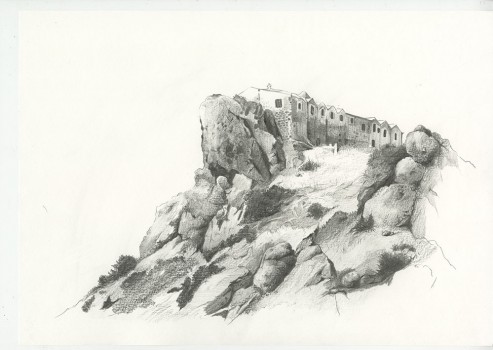
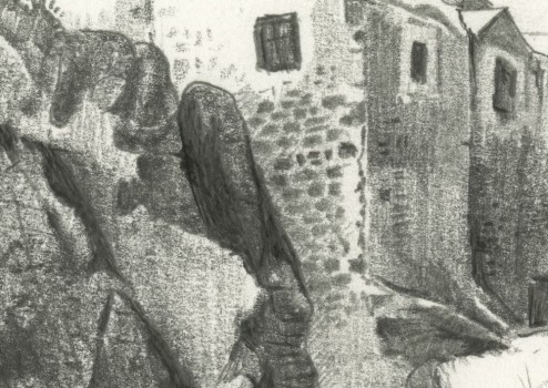
Stavrovouni – A study in graphite
This more detailed study took about 2 hours to complete. Once again, I am exploring alternative techniques with my pencil markings trying to represent the soft and rough textures of the landscape and buildings. I’m pretty happy with the results so far. The next challenge is sketching and illustrating the final drawing for my poster.

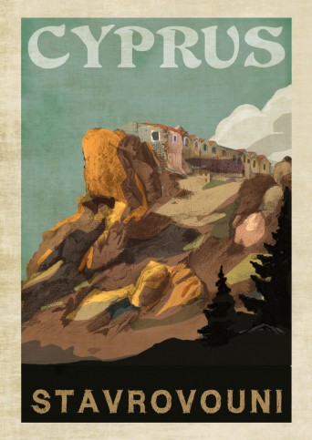
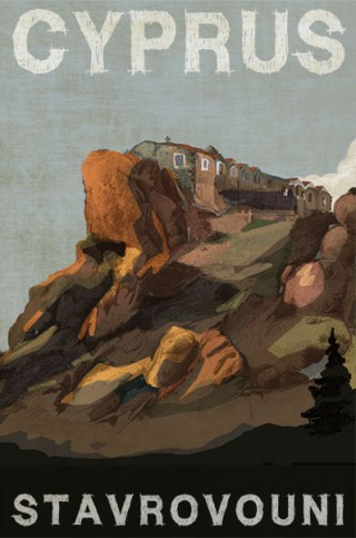
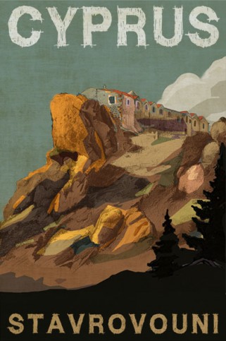
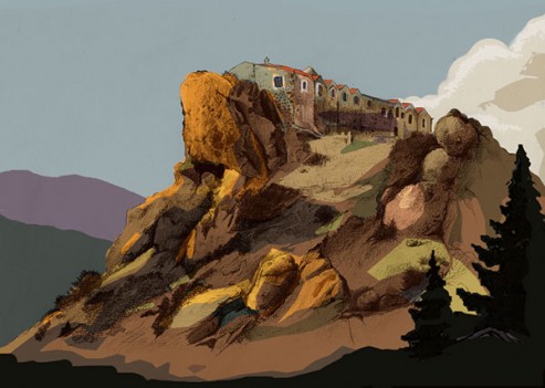
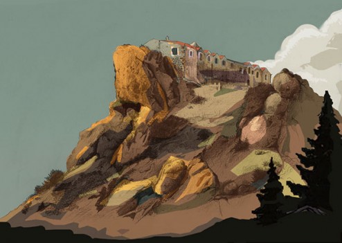
Once I had scanned my pencil sketches into Adobe Photoshop, I though it would be a good opportunity to test my colour palette for the poster. These early trials will help me determine the brush technique, colour scheme and texture required to create the look of a vintage travel poster. I can also get to explore the use of typography.

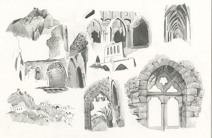
Here is another page of practice sketches for a second poster concept. This one is based on the famous Gothic Monastic Abbey called Bellapais near Kyrenia. I’m using a combination of different grade pencils (2H hard to 6B dark and soft) to alter the texture and smoothness of the stonework that is such a beautiful feature of the Abbey.
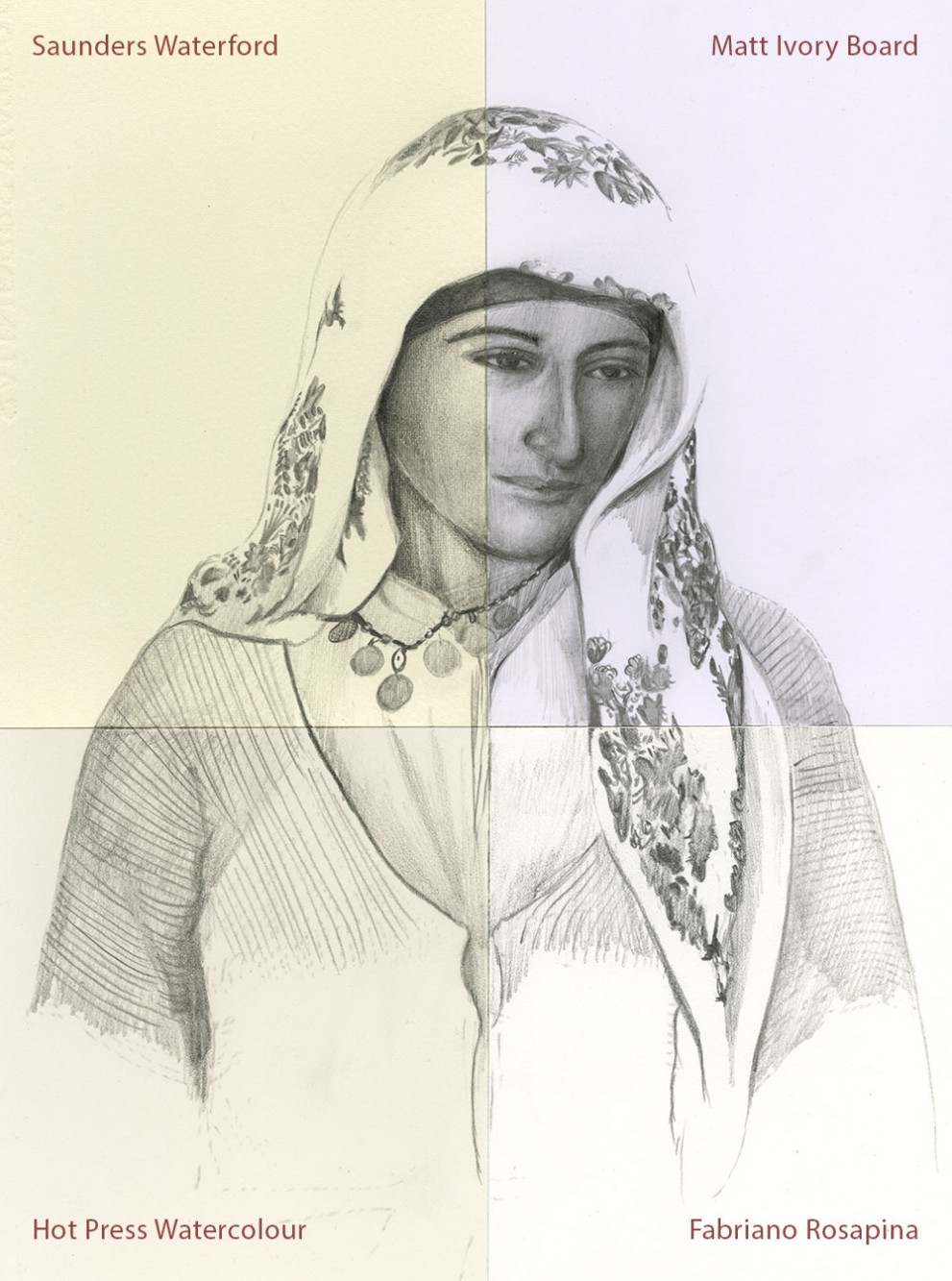
The sketch below is based on an old 19th century photo of a Cypriot peasant girl taken by John Thomson. I have created the sketch using a combination of four different papers to see how my pencil marks react and respond to the surface and texture of the paper. It’s probably not the best image to test this technique since the facial features of the girl varying greatly to her scarf and dress. The Ivory board was too smooth for my liking and quite unforgiving with regards to rendering the highlight and midtone areas of the face. In other words, you had to really alter the pressure of the pencil so that the blending of the marks were smooth and even. I think after this trial, I was happy with the Saunders watercolour paper, followed by the Hot Press stock.

